April 15, 2021No Comments

Global CFP Day 2021 Talk

Thanks to Global Diversity CFP Day (2/20/21)  for having me help new speakers who want to get up on stage!

Quick Links:
Slides
Transcript of talk


Resources:

  1. Books: TED Talks by Chris Anderson
  2. Accessibility: Inclusive Design for Accessibility, Low Vision Needs, W3
  3. Inspiration: Dribbble, Ted Talk, Lesbians Who Tech, Global Diversity CFP Day
  4. Presentation Templates Marketplace: Envato, CreativeMarket, SlideForest
  5. Presentation Makers: Powerpoint, Google Slides, Keynote, Canva, Adobe Spark, Prezi, Deckset, Beautiful.ai
  6. Color resources: Colourlovers, Adobe Color
  7. Avatar Generator: avataaars.com
  8. Contrast Checker: Colorable, Chrome Extension Picker, Contrast Checker
  9. Contrast Checker:  ColorBlind Simulator
  10. Photo/Video Stocks: Unsplash, WOCinTech, Gender Spectrum Stock, Flickr CC, Wikipedia CC, Pexels, Pixel Bay
  11. Icons: Flaticon, Pixel Bay, Noun Project
  12. Closed Captioning for speakers/webinars: WebCaptioner
  13. Apps to use Phone as clicker: Apps, Google Slides App, Keynote Remote
  14. Font pairing tool: Canva
Sketchnotes by Nitya Narasimhan @nitya

Sketchnotes by Nitya Narasimhan @nitya

Making Better Decks

Making slide decks for your talk can be scary and overwhelming for non-designers. There's also a lot of fears around making decks:

"I don't know how to start."

"I don't know what if it looks good."

"I don't know how to submits or format."

"It's so much work."

As a designer, I have the same blocks & fears as you do. I hope these resources and tips below can help you feel less stressed and help with a small makeover.


Why did I want to talk about this?

After 5 years of organizing and running decks for 100+ events/500+ decks, I wanted to share what I knew about behind the scenes and my thoughts on deck designing in general as someone who had to design pitch decks for early founders. You may have seen me at Lesbians Who Tech conferences (SF/NYC) or at 500 Startups events (Demo days, Diversity & Inclusion Summits)!

The reason why some folks might use slides is pretty much to help be able to tell that story and be able to give more visual context of information, making it a lot easier. Slides are visual. They're kind of like movies, comics, transcripts, books for a lot of people. It can really help us keep focus, and they can help the context of what you're speaking convey that emotion.

Why have slides?
As a viewer, I struggle with being in meetings without visual elements as a visual learner and on digital devices with small fonts & low contrast. My mother and I are those folks who use "LARGE" text sizes on digital screens.

We aren't the only ones, as there are over 5 billion people who are visual learners and over 314 million people in the world with visual impairment with visual acuity, color blindness, low vision, and more. In general, slides can help folks with different learning styles like visual learners or folks with accessibility needs.

How to get started

On a high level, when we think about slides, there is three layouts for templates that you have to think about.

  • Title page.
  • Divider page
  • Main page

If you think about slides, they've structured books to be similar with a title page, a chapter page, and the main page.

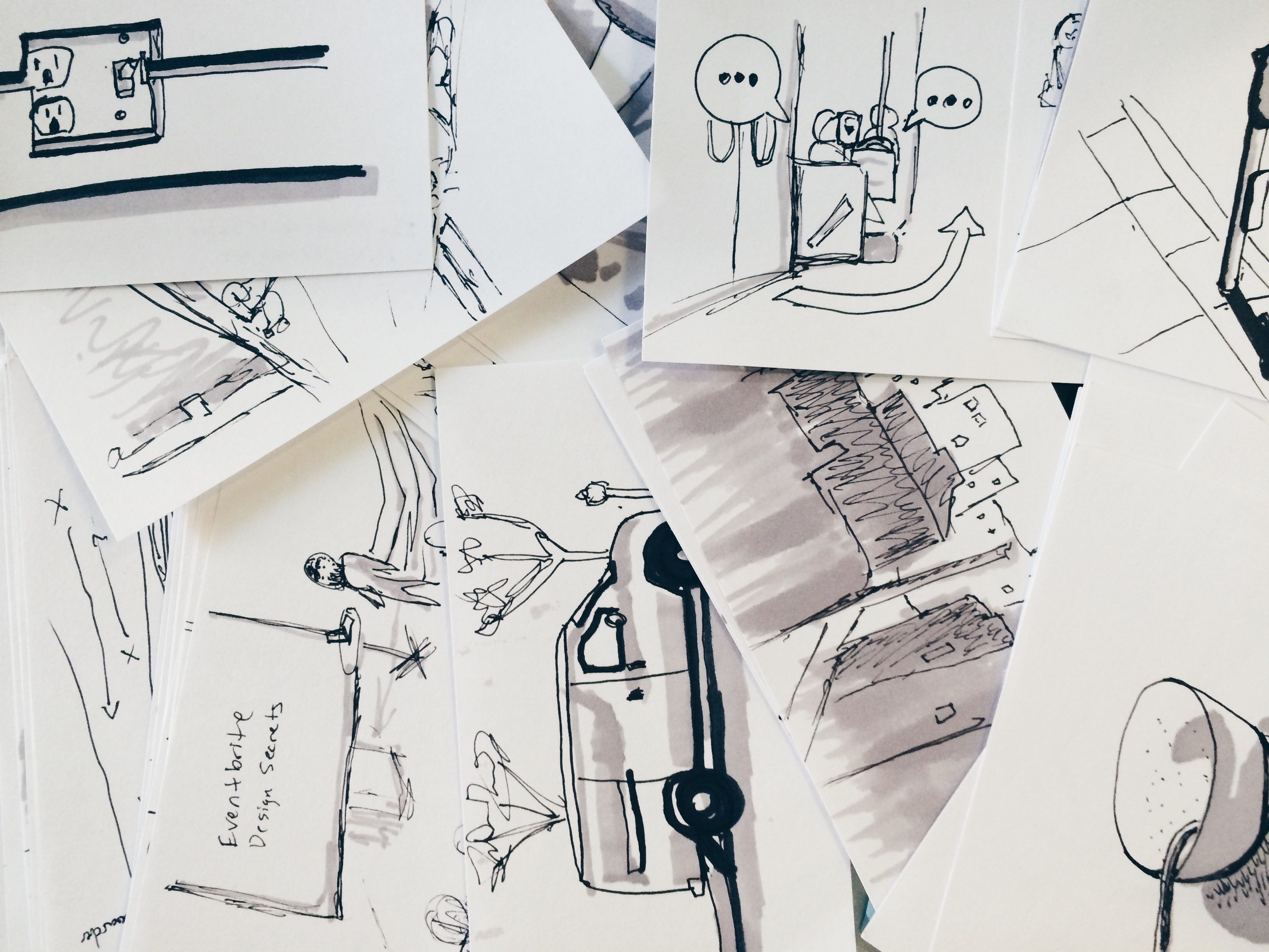
Photo of squares with sketches in themIdeation Stage

How to get started on making slides? I love to get started with exercises visual storytellers will use, a storyboard and a mood board.

  1. Storyboard: A great way to visualize your slides with paper and pencil instead of getting stuck on the design elements. (download here)
  2. Moodboard: Using Dribbble or take screenshots and keeping them in a folder. You only want to focus on the layouts, fonts, colors here. You can copy and get inspiration from here! Recommended sites to look: Dribbble/Behance/Slideshare or from talks you love from conferences like Ted Talks. Research the type of talk you'll be doing to get an idea of how slides are structured and to jump-start the creative flow. If your talk has more storytelling: Watch Ted Talks If your talk is a mix of story, tips, technical: Watch Grace Hopper/Lesbians Who Tech/Write Speak Code Conferences
    If your talk has more selling/pitching: Watch founder pitches on 500 Startups youtube channel.

Designing Stage

Designing is the tough part now! There are several ways folks make slides. Either hacking their own, using a template, a mix of both, hiring a team or individual, or no slides at all. I recommend for 1st timers to do a template or for people not too familiar with slide builder tools.

Presentation Templates Marketplace: Envato, CreativeMarket, SlideForest
Presentation Makers: Powerpoint, Google Slides, Keynote, Canva, Adobe Spark, Prezi, Deckset, Beautiful.ai
Hire a designer: Dribbble, Behance

Screen-Shot-2021-03-03-at-7.05.56-PM
Color:

I love to find inspiration using my mood, favorite colors, color wheel psychology, from my inspiration board, or using color palette sites like ColourLovers and Adobe Color.

Ensure the colors you use meet WCAG Accessibility standards of a ratio of 3:1 minimum. I tell people to go for the ideal of 4.5:1 ratio because you don't know if someone will you viewing your slides on a mobile device vs a projector.

Color Contrast Tools: WCAG Google Chrome Plugin ,Colorable, A11y, Contrast Checker, or a quick hack is turn down to 25% brightness on your computer. If you can't read from a far, it means your contrast ratio may be too low!
Color blindness simulations: Color Oracle , Color Blindly (avoid certain color combo like red/green together).

Font sizes:
Bigger font sizes, the better!
  • Font size for main copy: 24 points
  • Font size for headers: 36 to 44 points
  • Line spacing ideal: 1.4/1.5 is better for readability.

Sans Serif is most readable. Less cursive will help folks with dyslexia to read text easier. Enhance emphasis with visual elements like bold font-weight, icons, labels.

Copywriting:
  • Short headlines, 1-2 short sentences for copy is a good guidelines.
  • Use short, concise short for better clarity and for different cognitive abilities.
  • Use Title case or sentence case. ALL CAPS is more difficult to process.
Images:

Images are a fantastic way to give feelings or literal visuals for your talk. I like to go abstract with icons and less presentation of people in my slides. Below are some great resources to start with! They are free to use as long as there's attribution.

  • Photo/Video Stocks: Unsplash, WOCinTech, Gender Spectrum Stock, Flickr CC, Wikipedia CC, Pexels, Pixel Bay, Mapbox
  • Icons: Flaticon, Pixel Bay, Noun Project
  • Drawings: incorporate your own doodles or hiring someone to draw!
  • No images
Slides are finished!

After you finish your slides, the next step is definitely running through slides & timing, but also editing!  A tip from Chris Anderson, author of ted talks is to go through a lot of the copy and slides & DELETE DELETE DELETE. For my talk, I had a lot more bullet points and lists. I chose to delete all of it but 1 to illustrate how I like to do my lists. Editing & refining is an ongoing process. You may find while testing it doesn't flow right.

Here's a slide checklist:

  • Font size big enough & high enough contrast?
  • Is there a link to provide slides before or after?
  • Added Alt text to images, added image descriptions in speaker notes?
  • Used a max of 1-2 font types, sizes, and colors on 1 slide?
  • Have I tried to turn as much content into visuals?
  • Provide credit of images somewhere?
  • Would people be able to read my slides on a mobile or tablet sized window view?
  • Slides format correctly and accepted?
  • Make file available offline and shareable in case there's no wifi?

General Audio/Video Tips

Ask AV for help but also help AV folks back by meeting deadlines, sending videos & custom fonts. There is a lot of work when prepping decks!

It was really helpful when speakers told me WHEN they would give me an updated version if there was anything special to be on the lookout for, needed to test their slides or to help check their slide conversions.

Please double-check conversions (Ex: Google slides to ppt). It's better to export as a PDF or images and then throw it into a PowerPoint if all else fails because conversions don't do well with importing fonts.

Research & ask about the A/V setup of the event or where you’ll be speaking. It can help inform how you format or design your slides.

  • Venue? How far back will your audiences be compared to you? How’s the lighting? Lighting affects how you read on digital screens like a bright or dark movie theater would. If it's a dark theater, I may ask A/V to lower the brightness on the projector, add a transparent light grey/white overlay on top of slides with a white background. Or try to have a continuous dark background so it's easier to read type. Some folks have brightness sensitivity.
  • Projector? Is it a project or a tv monitor, how big are they? The type of screen and size affects audience readability. If screens are really small, that means the content will be small too. If screens are small, I would use minimal type and more imagery or break up slides with lots of content.
  • Format? Fullscreen or widescreen? What type of format will the event accept? It'll help ensure you submit the right format. Widescreen 16:9 is the most common format for tv monitors/projectors. It'll also allow more content per line to fit without feeling squished compared to 4:3 fullscreen format.
Day Of or Before
  • Practice with your phone as a clicker
  • Test slides at home and at venue
  • Bring a USB with backup files, save to drive
  • Do I have audio/videos? Tell AV folks if you do to expect audio
  • Confidence monitor show presenter notes or no?
  • Do they have my most updated slides/whens the deadline?
  • Do I have custom fonts? Send AV folks custom fonts (keynote)

With practicing, you'll be good to go! Once you finish your slides, you just completed one of the hardest things. Yay, good job!!

Anyway, despite all the checks you do, things can happen. Be kind to yourself during this process and slides can always be iterated upon after. I've changed this talk many times! It doesn't matter how professional or fancy it looks, slides can be super simple.

April 11, 2021No Comments

Write/Speak/Code 2019 Talk

Thanks for coming to my talk at Write/Speak/Code conference!

Here's resources, slides, and highlights from my talk. The recording will be up shortly.

Title:

Tricks Revealed To Making Better Decks & Submitting Them

Abstract:

Ever wish you could make a deck appear like a magician? After writing your talk, the next step is making a presentation slide deck, which may feel like the most difficult trick to pull off. If you’ve felt stuck staring at a blank screen not knowing where to start, you’re not the only one. This talk will reveal resources and tips to help you get unstuck (hopefully!) and prepare you with the knowledge to improve your efficiency in crafting decks when you need them. Learn simple guidelines, design principles, and tools to elevate the user experience for all your audience viewers offline and online and help build confidence in preparing them for send off from a conference A/V guru's perspective.


Link to Talk Slides


Making slide decks for your talk sounds scary and overwhelming. It can involve knowing a slide maker software, designing, editing, copywriting, and more. There's also a lot of fears around making decks:

"I don't know how to start."

"I don't know what if it looks good."

"I don't know how to submits or format."

"It's so much work."

All of these are real and I hope these resources and tips below can help you feel less stressed and help with a small makeover!

Why did I want to talk about this?

After 5 years of organizing and running decks for 100+ events/500+ decks, I wanted to share what I knew about behind the scenes and my thoughts on deck designing in general as someone who had to design pitch decks for early founders. You may have seen me at Lesbians Who Tech conferences (SF/NYC) or at 500 Startups events (Demo days, Diversity & Inclusion Summits)!

What are slide decks/Powerpoint slides?

They are a visual story like comics or films. They can help the content or a script and that’s been turned into a visual story for us to understand in a visual medium for visual learners and for the audience to takeaway quick points.

I like to think of slides as a movie movie: The audio is the speaker, while slides are moving pictures and subtitles are closed caption. Similar to closed captioning, slides can help viewers give clarity, help them focus, or listen better.

Why have slides?

As a viewer, I struggle with being in meetings without visual elements as a visual learner and on digital devices with small fonts & low contrast. My mother and I are those folks who use "LARGE" text sizes on digital screens.

We aren't the only ones, as there are over 5 billion people who are visual learners and over 314 million people in the world with visual impairment with visual acuity, color blindness, low vision, and more. In general, slides can help folks with different learning styles like visual learners or folks with accessibility needs.

How to Start

Below are the steps I'll be covering in this post. I do these simple steps in my own design process.

  1. Research
  2. Ideate
  3. Design
  4. Testing

Research

Research & ask about the A/V setup of the event or where you’ll be speaking. It can help inform how you format or design your slides.

  1. Venue? How far back will your audiences be compared to you? How’s the lighting? Lighting affects how you read on digital screens like a bright or dark movie theater would. If it's a dark theater, I may ask A/V to lower the brightness on the projector, add a transparent light grey/white overlay on top of slides with a white background. Or try to have a continuous dark background so it's easier to read type. Some folks have brightness sensitivity.
  2. Projector? Is it a project or a tv monitor, how big are they? The type of screen and size affects audience readability. If screens are really small, that means the content will be small too. If screens are small, I would use minimal type and more imagery or break up slides with lots of content.
  3. Format? Full screen or widescreen? What type format will the event accept? It'll help ensure you submit the right format. Widescreen 16:9 is the most common format for tv monitors/projectors. It'll also allow more content per line to fit without feeling squished squished compared to 4:3 fullscreen format.

Research the type of talk you'll be doing to get an idea how slides are structured and to jump start the creative flow.

  1. If your talk has more storytelling: Watch Ted Talks
  2. If your talk is a mix of story, tips, technical: Watch Grace Hopper/Lesbians Who Tech/Write Speak Code Conferences
  3. If your talk has more selling/pitching: Watch founder pitches on 500 Startups youtube channel.

Ideate

How to get started on making slides? I love to get started with exercises visual storytellers will use, a storyboard and a moodboard.

Photo of squares with sketches in them

  1. Storyboard: A great way to visualize your slides with paper and pencil instead of getting stuck on the design elements. (download here)
  2. Moodboard: Using pinterest or taking screenshots and keeping it in a folder. You only want to focus on the layouts, fonts, colors here. You can copy and get inspiration from here! Recommended sites to look: Dribbble/Behance/Slideshare or from talks you love from conferences like Ted Talks.

Design

Designing is the tough part now! There's several ways folks make slides. Either hacking their own, using a template, a mix of both, hiring a team or individual, or no slides at all. I recommend for 1st timers to do a template or for people not too familiar with slide builder tools.

  1. Presentation Templates Marketplace: Envato, CreativeMarket, SlideForest
  2. Presentation Makers: Powerpoint, Google Slides, Keynote, Canva, Adobe Spark, Prezi, Deckset, Beautiful.ai
  3. Hire a designer: Dribbble, Behance

Color:

I love to find inspiration using my mood, favorite colors, color wheel psychology, from my inspiration board, or using color palette sites like ColourLovers and Adobe Kuler.

Ensure the colors you use meet WCAG Accessibility standards of a ratio of 3:1 minimum. I tell people to go for the ideal of 4.5:1 ratio because you don't know if someone will you viewing your slides on a mobile device vs a projector.

  1. Color Contrast Tools: WCAG Google Chrome Plugin or a quick hack is turn down to 25% brightness on your computer. If you can't read from a far, it means your contrast ratio may be too low!
  2. Color blindness simulations: Color OracleColor Blindly (avoid certain color combo like red/green together).

Images:

Images are a fantastic way to give feeling or literal visuals for your talk. I like to go abstract with icons and less presentation of people in my slides. Below are some great resources to start! They are free to use as long as there's attribution.

  1. Photo/Video Stocks: Unsplash, WOCinTech, Gender Spectrum Stock, Flickr CC, Wikipedia CC, Pexels, Pixel Bay
  2. Icons: Flaticon, Pixel Bay, Noun Project
  3. Drawings: incorporate your own doodles or hiring someone to draw!

Font sizes:

Bigger font sizes, the better! 

  1. Font size for main copy: 24 points
  2. Font size for headers: 36 to 44 points
  3. Line spacing ideal: 1.4/1.5 is better for readability.

Copywriting:

  1. Short headlines, 1-2 short sentences for copy is a good guidelines.
  2. Use short, concise short for better clarity and for different cognitive abilities.

Testing

After you finish your slides, the next step is definitely running through slides & timing, but also editing!  A tip from Chris Anderson, author of ted talks is to go through a lot of the copy and slides & DELETE DELETE DELETE. For my talk, I had a lot more bullet points and lists. I chose to delete all of it but 1 to illustrate how I like to do my lists. Editing & refining is an ongoing process. You may find while testing it doesn't flow right.

Here's a general checklist:

  • Font size big enough & high enough contrast?
  • Added Alt text to images?
  • Use max of 2 font types, 2-3 colors on 1 slides?
  • Have I tried to turn as much content into visuals?
  • Provide credit of use of images somewhere?
  • Format correctly?
  • Make file available offline in case there's no wifi?
  • Checked out the venue?

General A/V Tips

Ask AV for help but also help AV folks back by meeting deadlines, sending videos & custom fonts. Theres a lot of work when prepping decks!

It was really helpful when speakers told me WHEN they would give me an updated version,  if there was anything special to be on the look out for, needed to test their slides, or to help check their slide conversions. 

Please double check conversions (Ex: Google slides to pptx). It's better to export as a PDF or images and then throw it into a powerpoint if all else fails because conversions don't do well with importing fonts. 

A/V Checklist:

  • Practice with your phone as a clicker
  • Test slides at home and at venue
  • Bring a USB with backup files
  • Do I have audio/videos? Tell AV folks if you do
  • Confidence monitor?
  • Do they have my most updated slides/whens the deadline?
  • Do I have custom fonts? Send AV folks custom fonts (keynote)


General Accessibility:

Inclusive Design for Accessibility,Low Vision NeedsW3

  • Sans Serif is most readable. Less cursive will help folks with dyslexia to read text easier.
  • Use Title case or sentence case. ALL CAPS is more difficult to process.
  • Enhance emphasis with visual elements like bold font weight, icons, labels.


Q&A:

What if there's no info on the venue or AV setup?

Go with the worst case scenario! Have a dark background with light text color. Big font sizes, minimal text.

What if there's no AV testing time?

Depending on when your talk is... you can sneak in early, during lunch, or a break, to chat to the AV person to ask to run through your slides. They are there to make sure it's the most updated and your talk goes smooth!

Where do I even start, everything is overwhelming?

Let's start slow with making 1 screen layout. Start with a title screen and then 1 content screen. Put 1 image or 1 word and move onto the next or copy a slide you've seen in your inspiration board or favorite talk.

I always tell early designers to copy and play with existing patterns to understand how it's made and applying the same technique here will further train your creative chops.  It's easy to get stuck too, so moving onto the next slides or only adding it a few words/images at first will help.

Resources:

Books: TED Talks by Chris Anderson

Inspiration: Dribbble

Presentation Templates Marketplace: Envato, CreativeMarket, SlideForest

Presentation Makers: Powerpoint, Google Slides, Keynote, Canva, Adobe Spark, Prezi, Deckset, Beautiful.ai

Color resources: Colourlovers, Adobe Kuler

Design anything: Canva, Adobe Spark

Avatar generator: avataaars.com

Contrast Checker: Chrome Extension Picker, Contrast Checker

Photo/Video Stocks: Unsplash, WOCinTech, Gender Spectrum Stock, Flickr CC, Wikipedia CC, Pexels, Pixel Bay

Icons: Flaticon, Pixel Bay, Noun Project

Closed Captioning for speakers/webinars: WebCaptioner

Accessibility Guidelines Tips: W3 Low Vision NeedsW3, WCAG, World Blind Union, ADOD

Apps to use Phone as clicker: Apps, Google Slides App, Keynote Remote

Font pairing tool: Canva

Color Wheel Psychology: Logo Company

Icons made by Freepik, Smashicon, Pause08 from Flaticon is licensed by Creative Commons BY 3.0

Stats: Movable Ink, FastCompany

Accessibility Stats: 3PlayMedia, World Health Organization

March 22, 2018Comments are off for this post.

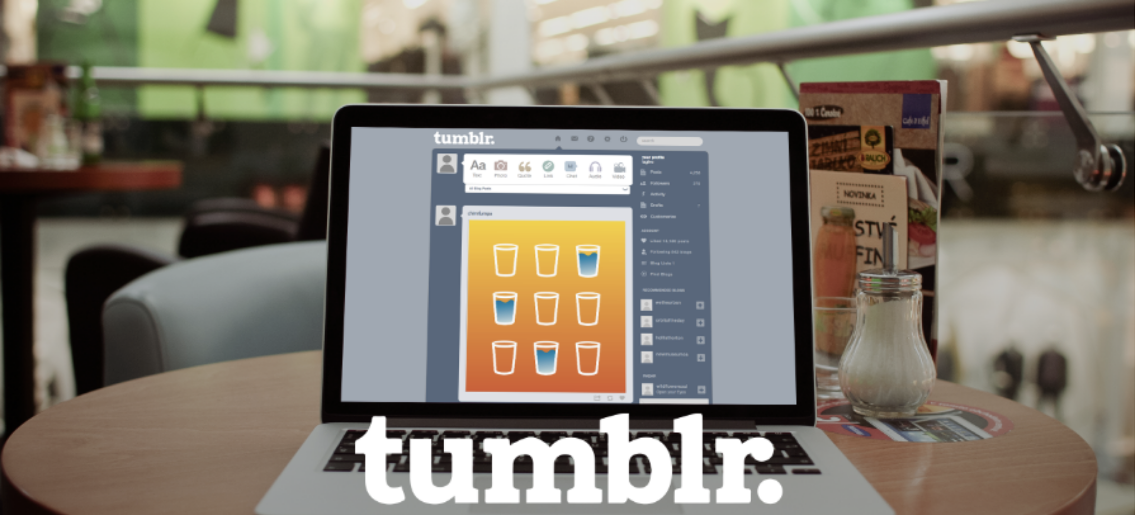
Exploration UX: Blog Lists for Tumblr

[vc_row][vc_column width="1/1"][vc_single_image media="798" media_width_percent="100"][vc_column_text text_lead="yes"]

Overview:

This is an exploration blog feature for Tumblr. The ability to filter your dashboard by the “Blog Lists” you created instead of receiving a timeline of posts, you'll get favorite blogs or content you want.

Check out the "Blog List" Feature Prototyped: 

[/vc_column_text][vc_row_inner][vc_column_inner width="1/2"][vc_column_text]Problem:

Users have to “dig” through their dashboard to find the content they want. Difficult to find friends or top bloggers you love. Difficult to remember names of users

[/vc_column_text][/vc_column_inner][vc_column_inner width="1/2"][vc_column_text]

Solution

Implement a “Blog Lists” feature to help the user find content quicker of bloggers they love.

Inspiration: Twitter Lists + Youtube

[/vc_column_text][/vc_column_inner][/vc_row_inner][vc_column_text text_lead="yes"]

Why do I care about Tumblr?

So let’s skip to 3 years later to 2010, when I met a friend after a dance performance. I was hooked onto Tumblr as a curious social media addict wanting to following a specific person. Little did I know I’d be part of the Tumblr community and a Tumblr addict within weeks. My 4th year anniversary was in May of this year (Tumblr told me!), I have 13,000+ likes, 4,000 posts, 300 followers, and following 790 blogs.

Tumblr has always been dear to my heart, I’m friends with people whom I’ve never met in real life. I have the steady 5-10 blogs I will check on weekly, My data plan hates me as I’m spent on public transit scrolling through the endless posts from my 700+ blogs I follow, and I remember when it was finals week and my best friend & I just sat across from each other in the campus library giggling at puns all night.

The demographics of Tumblr for those that are curious and keep asking “Who even uses Tumblr? Why not just facebook?”

[/vc_column_text][vc_separator sep_color="color-uydo"][vc_custom_heading]Design Process[/vc_custom_heading][vc_column_text]

  1. Persona
  2. Design Stories
  3. Task Flow
  4. UI Sketches
  5. Wireframes
  6. Prototype

[/vc_column_text][vc_separator sep_color="color-uydo"][/vc_column][/vc_row][vc_row][vc_column width="1/1"][vc_column_text]

1. Provisional Persona of Sarah

My first step is to create a persona. Sarah is an ideal user.

[/vc_column_text][vc_single_image media="804" media_width_percent="100"][vc_column_text]I love my followers, but them cramped into one dashboard system is inefficient when I want to see are my top favorite 10 blogs. Friends have told me they don’t use Tumblr as much anymore because the dashboard was filled with content they weren’t interested in.

My persona “Sarah” could find her favorite followers, her friends, her social work blogs, or her photography blogs to find inspiration, with a lists function similar to Twitter. The ability to share these lists could prove to be helpful to send to colleagues and social media.

Example of my process board of doing some various options…which didn’t work out. I tried asking current Tumblr users through social media what feature would they want and why. The reason being because we’re a little selfish and we have our own interests. It varies how much you use Tumblr and for what.[/vc_column_text][vc_row_inner][vc_column_inner width="1/2"][vc_single_image media="805" media_width_percent="100"][/vc_column_inner][vc_column_inner width="1/2"][vc_single_image media="809" media_width_percent="100"][/vc_column_inner][/vc_row_inner][vc_column_text]

2. Design Stories

With Blog Lists feature Sarah can…

Filter dashboard for specific content
Favorite blogs to Blog Lists

  • Create a new blog list
  • Edit name of a blog list
  • Archive a blog list to remove from main lists
  • Share a blog list with bloggers publicly
  • Copy link to page to send blog list to other usernames
  • Filter posts with a list
  • Search for a specific blogger
  • Choose a curated list for the content
  • View how many blogs are in one list
  • Favorite blogs to add them to a created list
  • Favorite the blog after viewing profile

[/vc_column_text][vc_column_text]

3. Task Flow

1st iteration of a task flow[/vc_column_text][vc_single_image media="817" media_lightbox="yes" media_width_percent="100"][vc_column_text]After this first screen, I was ready to add another direction a typical user would go. The goal is to not only add or remove in a blog list, but to overall be able to filter your dashboard posts with the lists you created. In doing one specific route at a time, it helped be able to finalize and more clarity to what wireframes and screens are most important to focus on.


2nd iteration with more details[/vc_column_text][vc_single_image media="818" media_lightbox="yes" media_width_percent="100"][vc_column_text]

4. UI Screens

Gave me options to consider how I’d implement this feature. There’s a lot of different ways a user can go about it, but after studying the UI of Tumblr, it made sense to incorporate it into the same place as where “Followings people” page and “People you know” is. There’s also a small limited space in the dashboard, so putting it under the multimedia tab would be easy for the user to see.[/vc_column_text][vc_gallery el_id="gallery-147646" medias="824,825,826,827" gutter_size="3" screen_lg="1000" screen_md="600" screen_sm="480" single_overlay_opacity="50" single_padding="2"][vc_column_text]

5. Wireframes

Created wireframes of the route of how a user would filter the dashboard with blog lists. Wireframes helped figure out the structure of the frames and allowed me for quick iterations and moving the pieces around to finalize. It only highlights one route a user could take, which was the more complicated way, so I thought it would be a good way to illustrate.

Blog list allows user (for users with curated blog lists already) to:

  • Select one blogs
  • Select multiple blogs
  • Select all blogs
  • Unselect blogs
  • Create a new list
  • Filter Dashboard

[/vc_column_text][vc_single_image media="829" media_lightbox="yes" media_width_percent="100"][vc_column_text]

6. Prototype

With the prototype complete, I wanted to be able to know these things:

How is the flow? Is it intuitive on the blog list page? Does the filter dashboard idea make sense?

To do the prototype and next steps of usability testing. I focused on the task flow and wireframe of 3 tasks.

  1. Enter dashboard (of user profile)
  2. Blog list page
    1. Task: Create a Blog List
    2. Task: Add/Remove blogs to list
  3. Dashboard (filter posts w/ list created)
    1. Task: Filter your dashboard with a list just created

1st Iteration Prototype: 

tumblr1 from t sripunvoraskul on Vimeo.[/vc_column_text][vc_column_text]Feedback:

User 1: didnt know where to go to add people to blog list. Needs next step in the filter post. Blog page was intuitive and easy to know how to add a user and create a new list.

User 2: Feels process was a little complicated, should simply go to page/profile and favorite or add to..(like youtube) I did sketch out alternatives of a user going through and adding a blog. I should definitely go back to show what other alternatives look like. Not sure about filter dashboard with posts (User only has 79 followers)

After User 2’s feedback, made me think about the “Favorite” aspect being a better interaction than “add to blog list” which would play into user’s profiles well. Having both filter posts inside blog lists came into consideration, but it would break the habit of a daily user of primarily using their dashboard to find content. Forcing the user to look at posts in the Blog Lists section wouldn't be ideal.

Before: Had it to where the user would click on profile settings to find
After: Turned into “Favorite” and adding the new button by follow button

[/vc_column_text][vc_column_text]2nd iteration Prototype
  1. Enter dashboard (of user profile)
  2. Blog list page
    1. Task: Create a Blog List
    2. Task: Add/Remove blogs to list
  3. Dashboard (filter posts w/ list created)
    1. Task: Filter your dashboard with list just created
    2. Task:Favorite a profile by visiting their blog

[/vc_column_text][vc_column_text]

Summary

Keeping it at a lower fidelity than my usual design job helped me move quickly to get some feedback and to be able to quickly switch out elements or fix small details I had missed that could easily confuse a user. I was kind of all over the place, but doing one direction at a time and writing down the ui flow made sure I wouldn’t stray from the task. It was a long process and many sketches were thrown out, however I’m pretty stoked and satisfied with the outcome. Small breakthroughs came while I was in the prototype stage like when I wanted to go back and select all blogs, how would I show that? I wouldn’t want the user to have to uncheck all the boxes, so a easy “Back to all blogs/Show all blogs” is a simple fix. Going into prototype flushed out the details of the Blog Lists more. It greatly affected the task flows and design stories because previous versions didn’t include the more specifics.

Frustrations came more so during the prototyping part because I used keynote so I could share via icloud. Only to find out Apple isn’t allowing icloud share until Yosemite OS is upgraded. The next steps would be to test it again and do more small detail screens for a user to click through with Invision. Getting feedback beforehand helped do a small shift in how a user would save a blog on a profile page. Wish I had done it earlier, however better late than never!


Note: I’m not affiliated with the Tumblr (although I wish!). I love Tumblr and wish the best for future Tumblr interactions. 

Some vector icons in prototype by Freepik from www.flaticon.com is licensed by CC BY 3.0[/vc_column_text][/vc_column][/vc_row]

March 20, 2018No Comments

What I Drew From Sketching

[vc_row][vc_column width="1/3"][vc_single_image media="746" media_width_percent="100"][/vc_column][vc_column width="2/3"][vc_column_text]

“You’re a designer, you can draw, right?”

Only if you want sloppy uneven lines and disproportional surfaces. I can draw, but that doesn’t mean it looks good. I’ve never been a sketcher in my life. When I was five, I had one of those cute whiteboard easels for children, allowing my inner artist to freeflow with weird creativity drawings, but when I started using the white walls of the living room as a whiteboard, it was taken away and thrown in the back of a closet, forgotten with the collected dust.

In high school, I picked up my dad’s Nikon film camera and found it easier to “draw” pictures with (not counting the film process).
As years progressed and camera technology got better over time, my trade as a photographer shifted to an editorial photojournalist in college. As a photographer, my first instinct was to unzip my bag and pull out my DSLR or camera phone to capture the reality of what I found intriguing. In addition to studying graphic design, I thought drawing classes would’ve helped my ability to do illustrative design work, however I couldn’t find any value in doing realistic drawings of nude models with charcoal sticks.

Two weeks ago, I took on a challenge to step up my sketching A-game. For three days, I spent hours sketching minute details and sceneries of San Francisco day and night. My goal was to reach 100 sketches using 4x6 index cards. As I journey into furthering my UX skills, it‘s important as a designer and photographer to be able to document inspiration from our daily observations.

[/vc_column_text][/vc_column][/vc_row][vc_row][vc_column width="2/3"][vc_column_text]My toolkit for this exercise: 100 4x6 index cards sketches in 3 days using 1 black thin pen, 1 sharpie, and 1 black 40% grey marker. Each sketch was 5–7 minutes long.


[/vc_column_text][vc_column_text css_animation="alpha-anim" animation_delay="400"]

Observe yourself. Observe others. As the famous baseball player
Yogi Berra said, “You can observe a lot by watching.” Problem is,
you have to know how to watch.
— Don Norman, “The Design of Everyday Things” (2002)

[/vc_column_text][/vc_column][vc_column width="1/3"][vc_single_image media="722" media_width_percent="100"][/vc_column][/vc_row][vc_row][vc_column width="1/1"][vc_column_text]

4 Learnings I Drew From Sketching

With intentions to reach 100 sketches in 3 days, I rounded to 70 sketches total, but what I left with were parallels I found in my past photography and design experience. Sketching allowed explorations to unfold with emphasis on observational and problem solving skills. I’m hoping these connections will remind me to be keen and observant while moving forward to being a better designer.

What can I learn from sketching? Below are learnings I found. As a fellow creative, hopefully this inspires you to join the sketching movement.

[/vc_column_text][vc_gallery el_id="gallery-484814" type="carousel" medias="723,725,727" carousel_lg="3" carousel_md="3" carousel_sm="1" gutter_size="3" carousel_interval="3000" carousel_navspeed="400" stage_padding="0" single_overlay_opacity="50" single_padding="2"][/vc_column][/vc_row][vc_row][vc_column width="1/3"][vc_single_image media="728" media_width_percent="100"][/vc_column][vc_column width="2/3"][vc_column_text]

1. Assess the big picture first

Which marker did I need to use and why? Depending on what I was sketching, I heavily used the 1 black thin pen as the primary. However, sometimes I started with the 40% grey marker for sketches with large shadowed spaces over the thin black pen. It proved not drawing the correct outline made the process quicker and the lines cleaner by drawing in the outlines of the object later. As I was sketching, I noticed after the 40th one, I knew when to grab the 40% grey marker over the black pen based on my scope of the overall scenario.

Before any problem, we always have to address the bigger picture first to figure out the best approach. Should I jump into Sketch or Photoshop? or do I try usability studies over user interviews? or is it taking the photo of the scene at a wide angle or zoomed in?

We each approach a problem differently. However, the more practice you’ve done, the quicker you can make the assessment. If you were new in a giant mountainous forest with multiple trails to choose from, you would be a lost squirrel. After you’ve been to that giant mountainous forest your 9th time, you would know which trails to take based on the elevation, difficulty of the hike, or distance. After deciding the trail, your next step would be to know how much X amount of water to take, with X shoes to wear, with X gear to carry.

[/vc_column_text][/vc_column][/vc_row][vc_row][vc_column width="1/3"][vc_single_image media="738" media_width_percent="100"][/vc_column][vc_column width="2/3"][vc_column_text]2. Observations can lead to incredible discoveries and opportunities

My typical commute along Embarcadero is better than most people on work days. I can’t complain my 10-minute bike ride along blue bay waters is boring.

Surprisingly, I had never seen the sunrise along Embarcadero before. On my third day, I woke up early at 6 a.m. to sketch. I figured 40 mins of walking to work would end up being 1 hour if I stopped and sketched on the way. If I hadn’t stopped at some of the points on this route, I would’ve missed interesting findings. When I was sketching Oakland across the bay, I found a random sharpie drawing of a cartoon character on a pole. Sketched it, then got entranced by the sunrise for 20 minutes. My sketching commute ended up being 3 hours long.

Till this day, I still remember my first ever 7 a.m. sunrise commute with my newly five sketches in mind. The same route can still present a new perspective. You might consider your current direction mundane, but take a moment to hit pause and reflect. Serendipity could be around the corner.[/vc_column_text][/vc_column][/vc_row][vc_row][vc_column width="1/3"][vc_single_image media="740" media_width_percent="100"][vc_single_image media="739" media_width_percent="100"][/vc_column][vc_column width="2/3"][vc_column_text]3. Spending time with the subject makes an impact

When strolling one night in San Francisco, I noticed this guy with pink polka-dotted luggage and a black trash bag standing by a bank. In the same position for what felt more than 10 minutes while I was sketching him, he didn’t flinch once. If passing by him, you would’ve guessed he was drinking water or digging the trash can for scraps leftover. If you stepped to just the other side of him, you could’ve missed what he was really doing. Breathing into a portable oxygen bottle. At least, it’s what it looks like.

If I hadn’t taken the time to sketch him, I would’ve missed this interesting discovery about a typical guy found on the streets of San Francisco. Like how I said earlier, observations can lead to discoveries, but spending a considerate amount of time with a subject can break down any assumptions and pull out a better story.

In photography, we’re accustomed to shooting first, editing later. Those in the documentary field spend anywhere from hours to years at a time with a subject. Building the rapport can strengthen the relationship and trust between you and the subject. Not saying for sketching you have to spend a lot of time, but your sketches will turn out better.

Someone recently asked me how TIME magazine photographers do what they do. How can they approach subjects so easily? It’s not easy. You’ve got to be honest and transparent about what you’re doing. Take advice from Deanne Fitmaurice, a Pulitzer Prize-winning photojournalist, where she describes her bold moves and findings by observing baseball legend Barry Bonds with her camera.[/vc_column_text][/vc_column][/vc_row][vc_row][vc_column width="1/3"][vc_single_image media="741" media_width_percent="100"][/vc_column][vc_column width="2/3"][vc_column_text]

4. Sketching is more memorable

People love sketches! It shows you took the 5–10 minutes to pay attention rather than taking seconds snapping a photo. With sketching, you’re more likely to prioritize which details you’re going to draw first right? Who stands out more and why? Below, I started with guy sitting in front of me and then moved to Jeff, the founder of Litterati, at the time. Later in the evening, I tweeted the photo of my sketch and was later featured on Litterati’s facebook.

[/vc_column_text][/vc_column][/vc_row][vc_row][vc_column width="1/1"][vc_column_text]

Sketch more. Take photographs less.

Overall, there was a realization of remembering technology can make one miss the mix of nature’s finest and San Francisco’s cultural beauty. John Ruskin describes how if two people were to take the same lane, with one being a sketcher, you would get two completely depicted approaches. Of course, with the sketcher being the one with a more profound outlook.

But what will the sketcher see? His eye is accustomed to search into the cause of beauty, and penetrate the minutest parts of loveliness.
— John Ruskin

In only 3 days, I’m proud to say my sketching ability went from circle heads to real human-shaped heads after the 20th sketch. There’s a lot more definition in my drawings and my hand no longer shakes at drawing straight lines.

Lastly, The parallels found in simple sketching are learnings I’ve taken as part of my journey as a creative designer. Not to say I will completely stop taking photographs. I will still take photographs ever so often and will sketch on daily breaks. When I get super committed and pro at sketching, I’ll join the global urban sketchers movement. Until then, there’s a few more sketches found on my blog.

So, next time you’re out in your city, take a walk, observe, and sketch.

[/vc_column_text][/vc_column][/vc_row][vc_row][vc_column width="1/1"][vc_gallery el_id="gallery-484814" medias="742,743,744" gutter_size="3" screen_lg="1000" screen_md="600" screen_sm="480" single_overlay_opacity="50" single_padding="2"][vc_column_text]

Read the original on Medium


[/vc_column_text][/vc_column][/vc_row]

January 24, 2018No Comments

Transcending Gender Binaries

For my company's retreat, I was nominated to host a workshop. I chose to host it on discussing being openly transgender in the workplace and tips coworkers can do to be better allies.

Slides:

January 24, 2018No Comments

How to Make a (Person)a

2014 presentation.

How to make a persona is a presentation of how I took on making a "PERSONA". For past design projects, I would do research by being in ones shoes. Also, I was a drag king and I had to create my own persona. What is it like being someone who is "you" but not "you" at the same time? This was my process of how I created my drag king persona, TJ Maxxx.

Slides:

January 24, 2018No Comments

Why Type Matters Presentation

Presentation Nov. 20, 2014

For Tradecraft UX 7, I did an intro lesson about why typography matters in setting tone, sales, websites, and more.


Slides:

January 24, 2018No Comments

Creating Trans Inclusive Workplaces

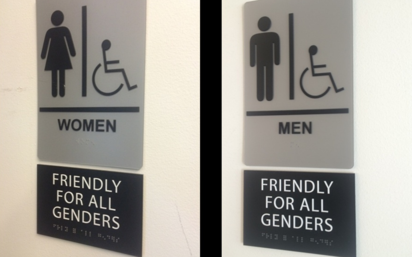
I had the opportunity to present to Malaysia's first symposium on Barriers to Public Facilities, particularly toilets, for Transgender Persons as part of a series of symposia organized by the Penang Transgender Committee,  Justice for Sisters, Suara Rakyat Malaysia (SUARAM) Penang and Penang Advocacy Community Association (PACA).

I spoke about my experiences and what I've seen at my own workplace and how Malaysia workplaces can influence public culture to be more accepting of transgender individuals.


Excerpt below written by Thi Laga (thank you to the organizers!)

Promoting inclusivity in the workplace

A guest speaker for this session, T Sripunvoraskul, introduced a progressive company called 500 Startups that has one the best inclusive policies in the workplace. 500 Startups is a global venture capital seed fund headquartered in the Silicon Valley. With a network of startup programme and over $300M in committed capital, 500 Startups has invested in 1,600 technology startups all over the world.

500 Startups has strict non-discrimination clauses in their policy:

Policy Example 1:

This business is dedicated to providing a harassment-free event experience for everyone, regardless of gender, gender identity and expression, age, sexual orientation, disability, physical appearance, body size, race, ethnicity, religion (or lack thereof), or technology choice.

Policy Example 2:

All qualified applicants will receive consideration for employment without regard to race, color, religion, sex, gender, gender identity or expression, national origin, or protected veteran status and will not be discriminated against on the basis of disability.


T shared that 80% of Fortune 500 companies have transgender identity protections, offering comprehensive policies, benefits, and practices that facilitate greater transgender inclusion in the workplace. Today, 50% of these companies offer transgender health coverage, compared to 2002 when there were none.

Impact of inclusive policies:

  • Higher productivity of employees
  • Higher retention of employees
  • Allies want to work with inclusive companies
  • Employees protect the privacy of transgender persons in relation to their gender identity to avoid stigma
  • Broadening network of talent
  • No judgment, harassment-free
  • Representation of the real world

Other reasons:

  • More customers
  • Lessen risks and legal action for trans discrimination
  • To align with local, state, federal laws as human rights evolve
  • Position company as more diverse externally and internally
  • Recruit and retain new talent of younger generations
  • Set an example for other companies
  • Built-in humanitarian work by providing safe spaces


Negative impact of discrimination against transgender community

These progressive policies did not happen overnight. The LGBT movement in the United States have long lobbied for transgender rights and have received nationwide recognition since the 1960s. Companies that are not inclusive have faced negative impacts. In March 2016, North Carolina passed the Public Facilities Privacy & Security Act, also known as HB2, which legislates that in government buildings, individuals may only use restrooms and changing facilities that corresponds to the gender on their birth certificates.

This has been criticised because it prevents transgender people who do not or cannot alter their birth certificates from using the restroom consistent with their gender identity. Big companies such as Google, PayPal, and Apple took a public stance against the passing of the HB2 bill. As a result, the state of North Carolina lost almost $400 million in 6 months.

Other negative impacts of transgender discrimination on businesses:

  • Hurt branding
  • Hurt business
  • Loss of customers
  • Loss of employees
  • Loss of money
  • Damaged reputation overseas
  • Risk of being unable to recruit overseas talent


Slides: 

November 23, 2014No Comments

My Design Journey Presentation

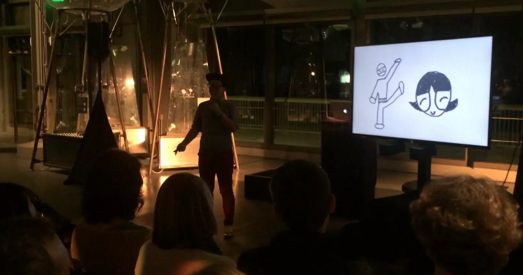
Sum of the Parts is a speaker series held by Autodesk, where they invite innovative people to talk candidly about the hard problems they’ve faced and how they have succeeded. On November 11, “SOTP Flips the Stage” was led by Kate Rutter as the lead speaker followed by 10 other speakers telling design stories or projects. Guess what, I was one of them!

You’re welcome to check out my strange design journey. I was audience voted as best speaker.

Below are my slides.

From t sripunvoraskul on Vimeo.